Harry Rosen Sale Branding
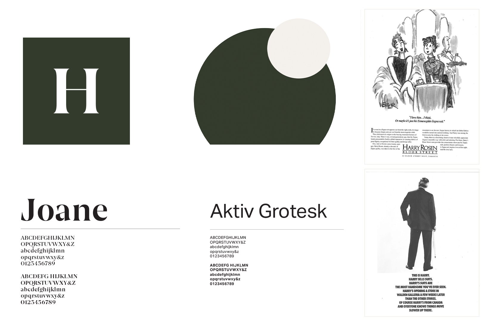
Finding inspiration in Harry Rosen’s heritage and the latest brand updates we tied the two together to re brand sale.
Looking back to their award winning magazine ads from the 60 and 70s we leveraged this cheeky confident voice in sale to furthers invest in the brand’s renewed tone of voice and image.
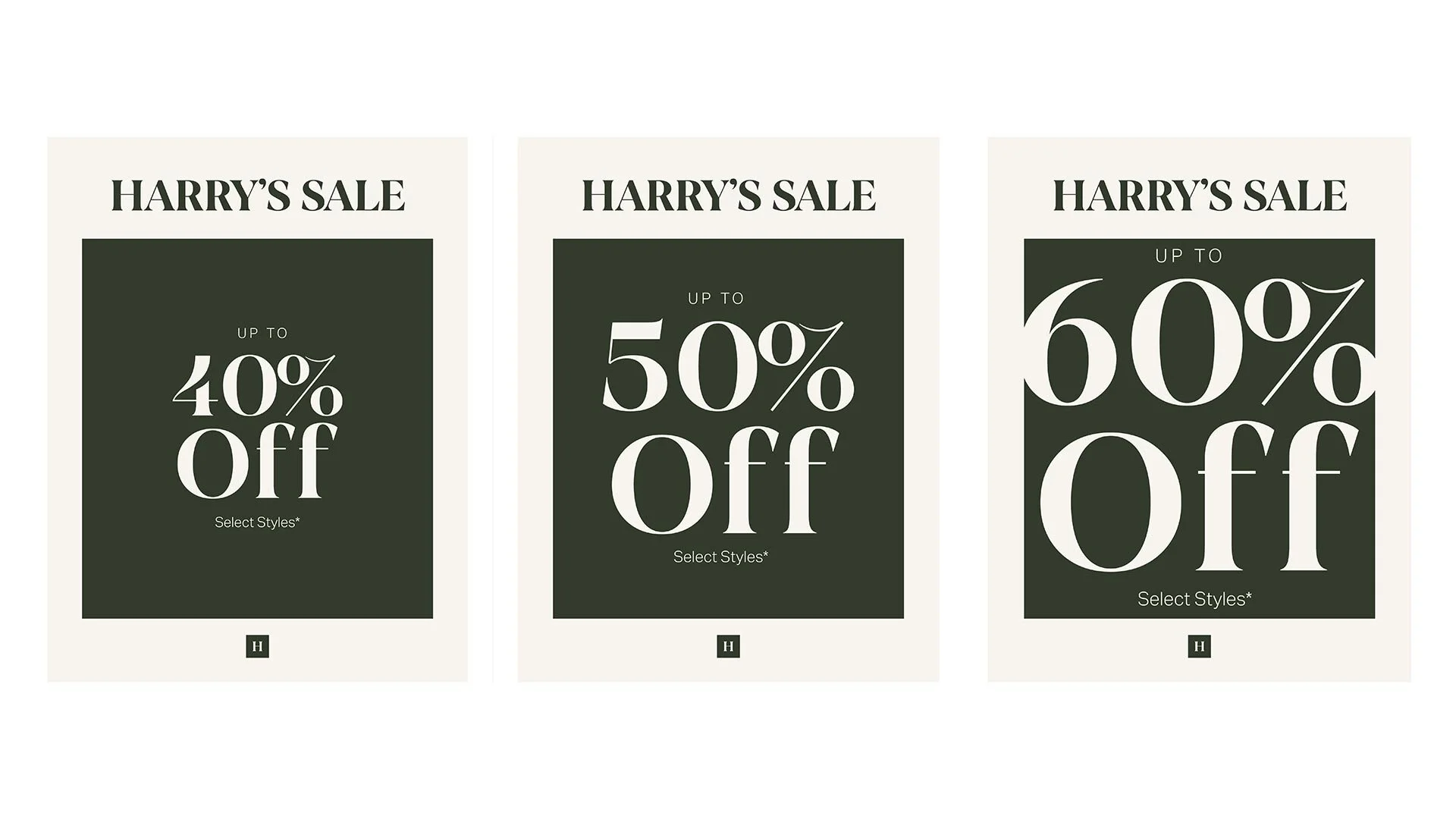
The goal was to make sale feel promotion but elevated.
Therefore, we stayed away from reds and neons. Focusing on a promotion that instead gets larger and large overwhelming it’s contain box.
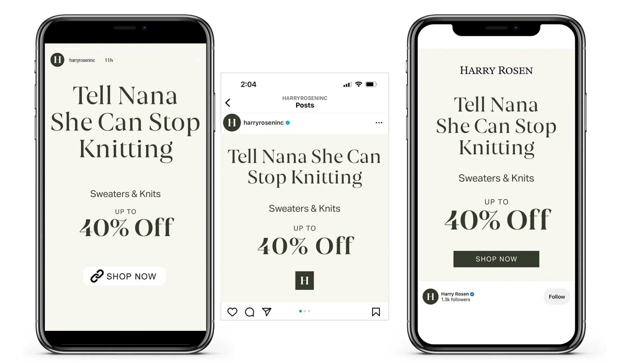
With limited graphic ability on site we create an alt to the original design system for flexibility. In order to still signal when the offer increases.
Simple playful lines are written for category sales that hint at the specific product on sale.
Team Credits
Copy Direction: Ben Kriz / Logan Ross
Art Direction / Design Direction: Grace Boivin


