Harry Rosen Web Design
With the latest brand refresh it was time to modernize both the look and the experience of the Harry Rosen website.
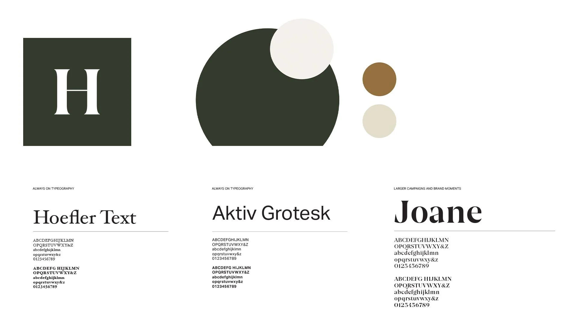
New crest and colours were implemented with specific roles to create consistent visual cues with the customer.
Our new brand type face Joane was implemented to signify specific campaign and brand moments.
The new brand c rest needed a place to live in order to start building that recognition with the customer
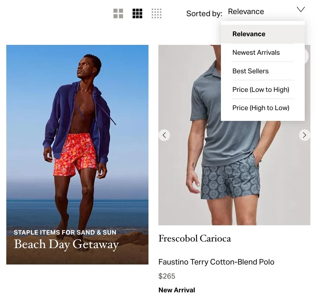
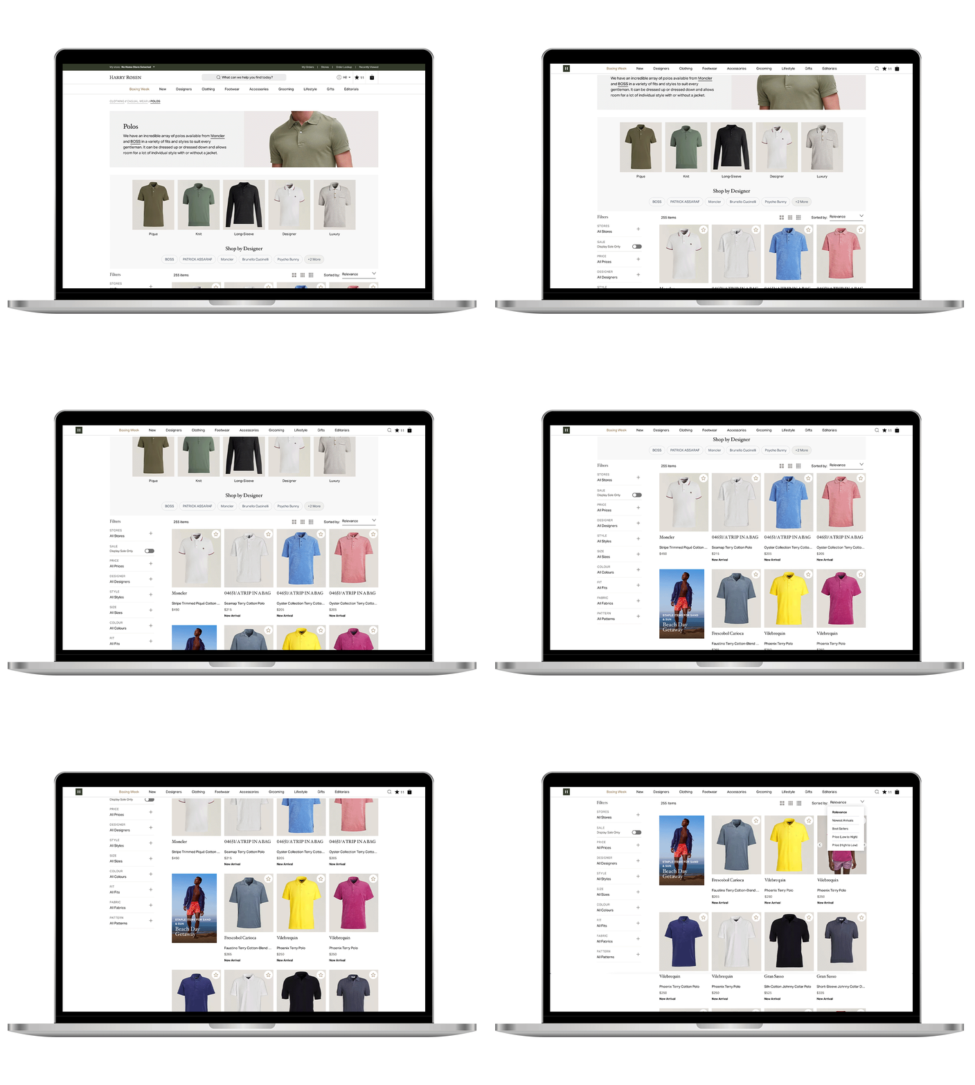
New product array page design
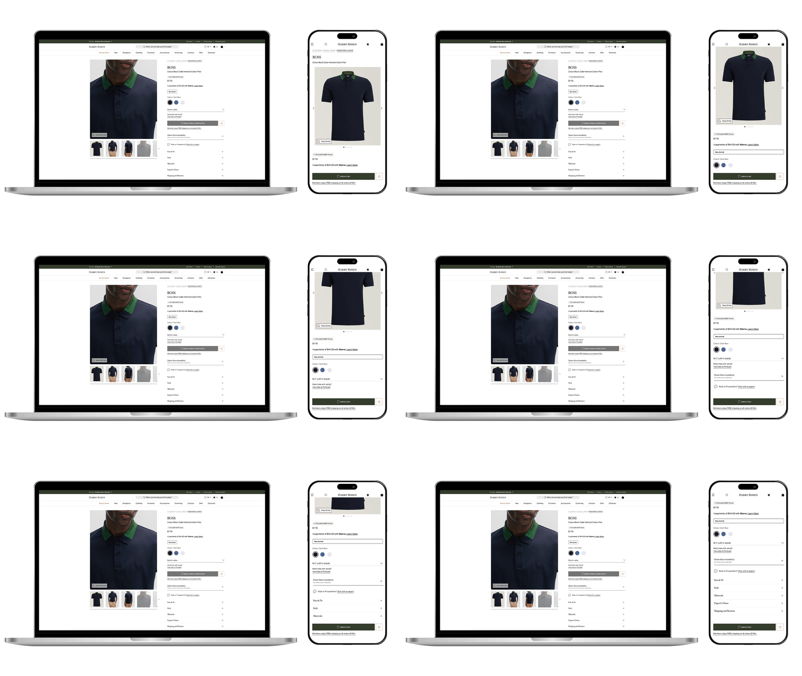
New Product description page design
Team Credits
Development Team: Orium
Art Direction / Design Direction: Grace Boivin


